I’ve been reading through my copies of Wormskin (Norman & Gorganmilk) again and I’ve also got The Peridot (David McGrogan) kicking around my desk now because of it. I quite like the idea of throwing some ideas into a zine like this so that’s what I’ve been working on recently. (This something that I played around with before if anyone spotted my unlaunched Patreon and was actually what Merchants and Civilisations was originally for.)
Anyway, I keep finding hurdles to slow myself down with. I’m unsure why I’m that kind of person. One such hurdle was “I can’t even tell if this text should be justified or not.” I ended up Googling for it and found Butterick’s Practical Typography. It’s full of advice that I’m working through. I’d recommend it for anyone writing who isn’t likely to get an editor or layout person.
It talks a lot about typography not being about aesthetics. Instead, it’s more about being appropriate for your subject area and being in the right format to sink in as completely as possible whilst reading.
For completion: with regards to left aligned or justified, it suggests following personal preference. There’s apparently little evidence of one being better than the other. I’ll go with left aligned right now, because it leaves more space for notes, but I don’t have a strong preference.
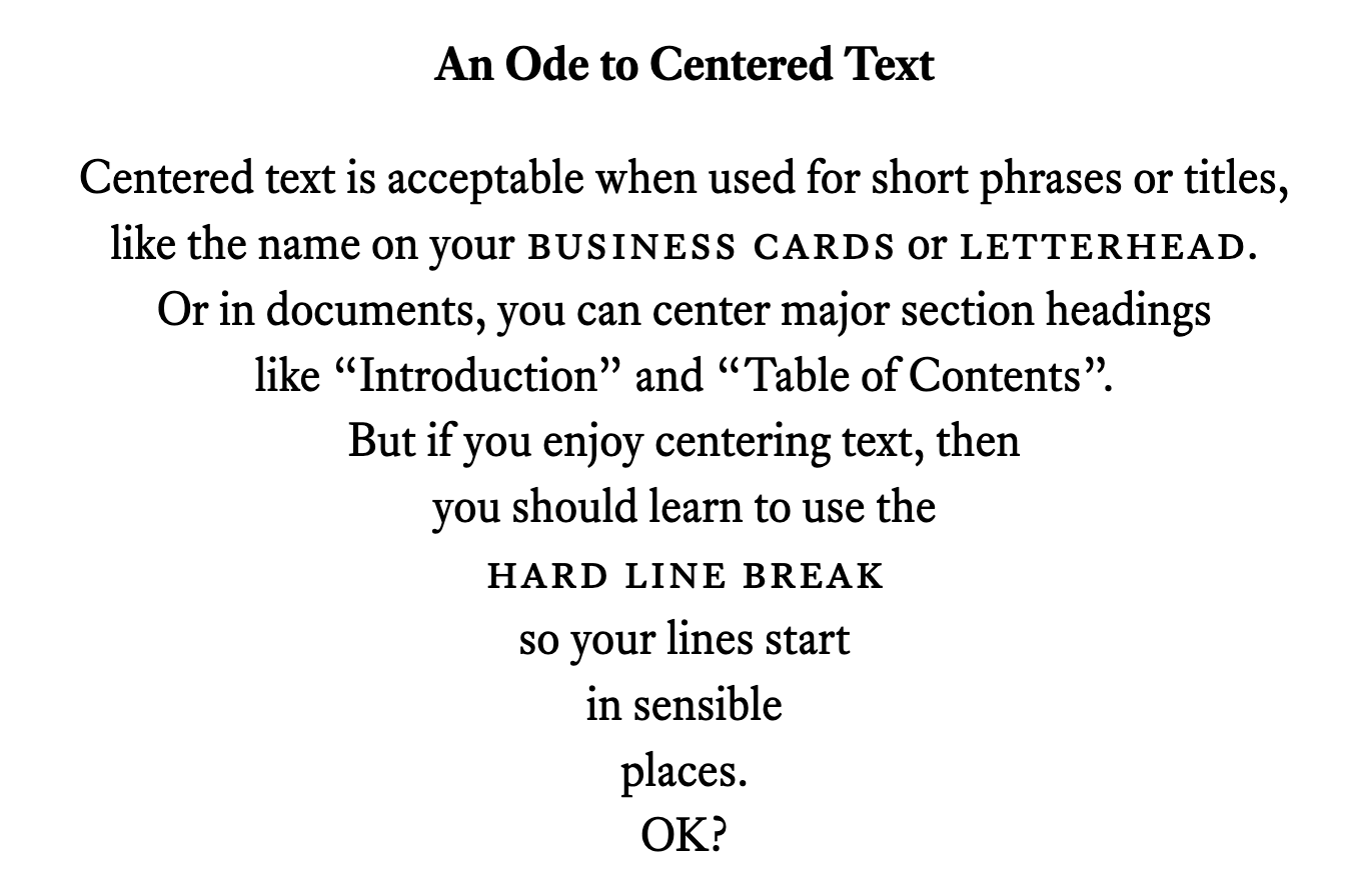
I did wanna do the preface centred but was heavily berated by Butterick’s chapter on that.