I have been working on Arcana Delve today, making the basic premise as well as jumping into create the character class cards.
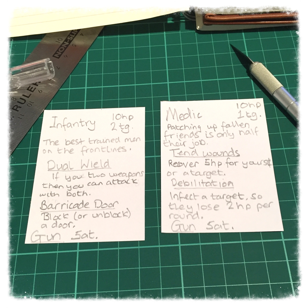
My hand writing isn’t uniform – changing size quite drastically – so I’m hoping that when these cards are typed up then it will look less busy. For the moment, I’ve gone with putting the rule text for each special ability (Tend wounds or Dual wield) straight on the card. That’s something I can change though – I could throw that into the rule book. The player will have to look up what the feature does, but after the first or second time using it then I’d expect them to memorise it.
Magic the Gathering prints a usable chunk of the rule text for each mechanic on the card, but only in the set it’s released. After that, you’re expected to know what the affect of Infect is. They remove it from the card because you end up with quite busy cards – like what mine look like above.
Daniel Solis’ video series mentions the importance of a consistent card face.
[youtube=://www.youtube.com/watch?v=yKyV6Klxb2g&w=854&h=480]
I’ve made sure that the components will all be in the same place. Class name is always large in the top left, the health points and toughness is in the top right, just below is some flavour, and at the bottom is the actions they can take. This should decrease the cognitive load needed to understand the card. That’s useful when you’ve cards like mine – full of text.
Sitting around a table, it’ll be important for everyone to see what class the person opposite them is playing. I’m not sure if the bold “Medic” is enough, or if I should add in an icon. The icon might be useful: later on I can use it as a legend, to avoid having to say “Medic”. Freeing up the space with a proper font, and maybe dropping the rules on the card would mean a logo would definitely fit.
The main reason I’ve missed off any style or drawings is because I just can’t do it. Previously, I get excited about an idea until it needs some artistic design, and then I get dissuaded. These days, I like to avoid drawing so that I don’t lose my excitement because I couldn’t draw anything close to a person. That’s the same reason I stopped trying to use InDesign actually – it’s just way too complicated which was slowing me down more than it was helping.
All the numbers on the card are completely made up at the moment. I’ve not gotten far enough to be able to play a game of this yet, and so I don’t know what numbers are sensible. I mostly put them in there – randomly – to stop indecision later on. It’s better to have something down than spend hours trying to work out the best number algorithmically, wasting your enthusiasm on it.
Next thing for me is terrain tiles.